Chabad of Potomac - Branding
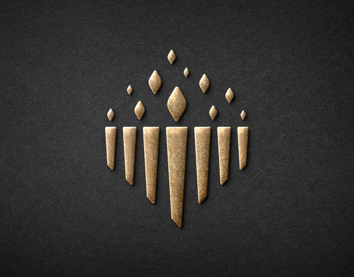
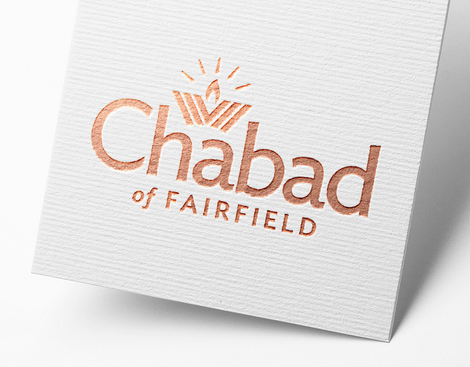
The logo is built around a torch that can be held proudly and passed along to others. The flame is actually two dancing flames that intersect, expressing the variety of backgrounds from which we approach Jewish discovery, and the joy of sharing the journey among friends and families. You’ll see a Menorah leaning outward and upward: a community of individual “lights” moving as one in the firm tradition of our Jewish roots. Finally, the Chabad wordmark is set in a well-rounded and wide open font, an appropriate way to describe the embracing atmosphere that makes us a unified—and unifying—community. One more beautiful feature is the third flame formed by the intersection of the two larger ones, hinting “When two Jews come together, something positive should result for a third...”
You may also like
