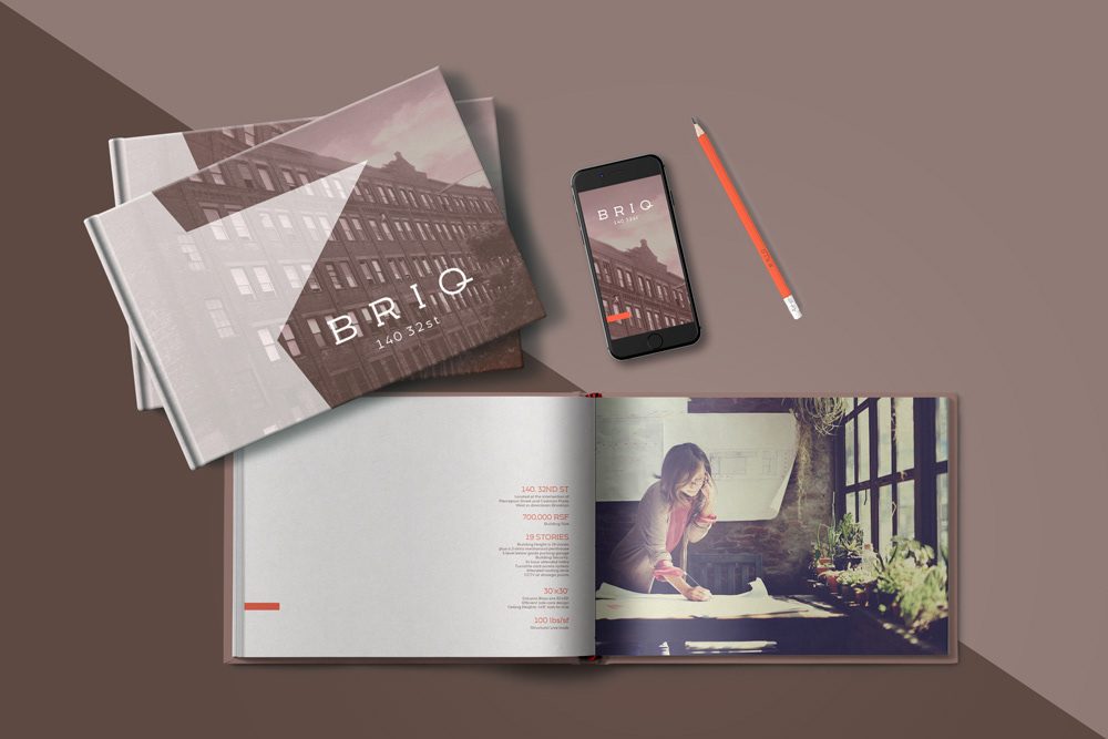
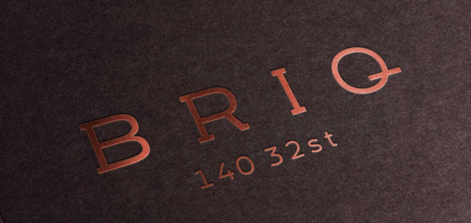
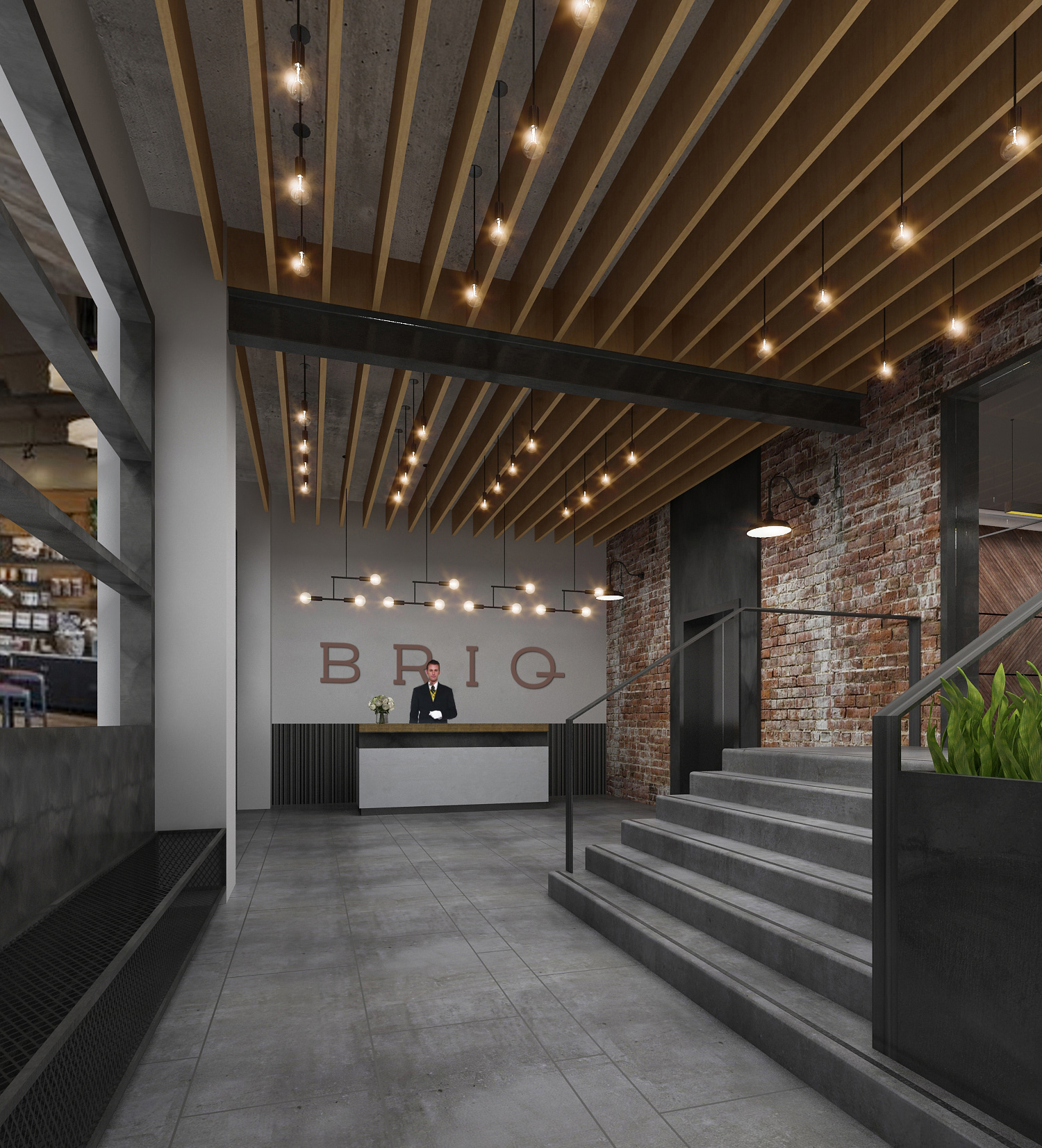
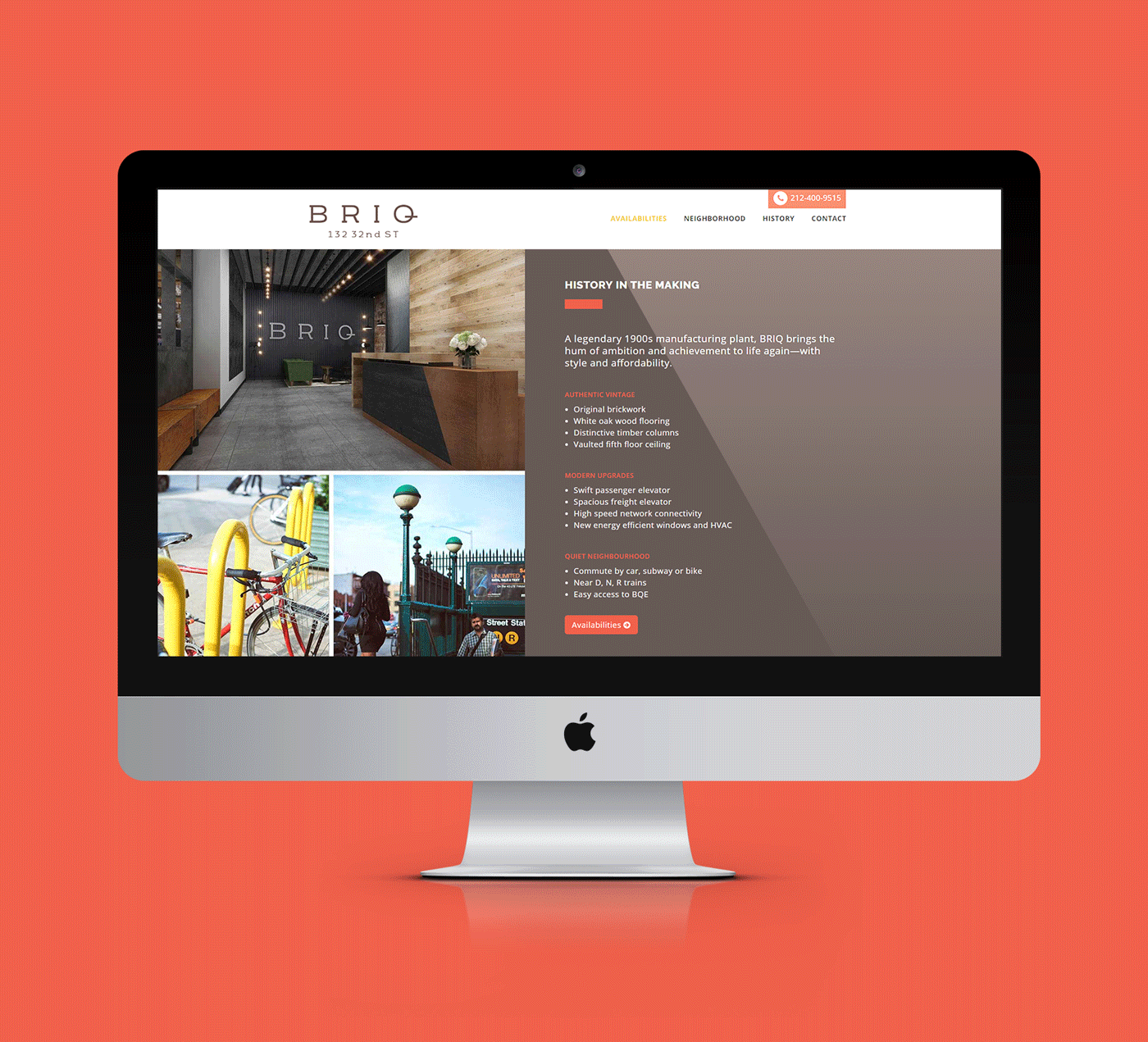

Like the environment it expresses, the BRIQ brand is sophisticated in its simplicity. The evenly-spaced all-caps Logo/wordmark hints at industrial handiwork, with appropriate elegance for dressed-up business. The extended Q offers potential tenants the platform on which to "start-up" and the springboard from which to "move up." For the extended BRIQ identity, we introduce some favorite elements of the building's character—the anchor stars in particular—in sepia tones that give the century-old history a warmth and welcome. A bright accent mark ("the briq") evokes a flash of modernity at every turn, representing the building's modern-day amenities.