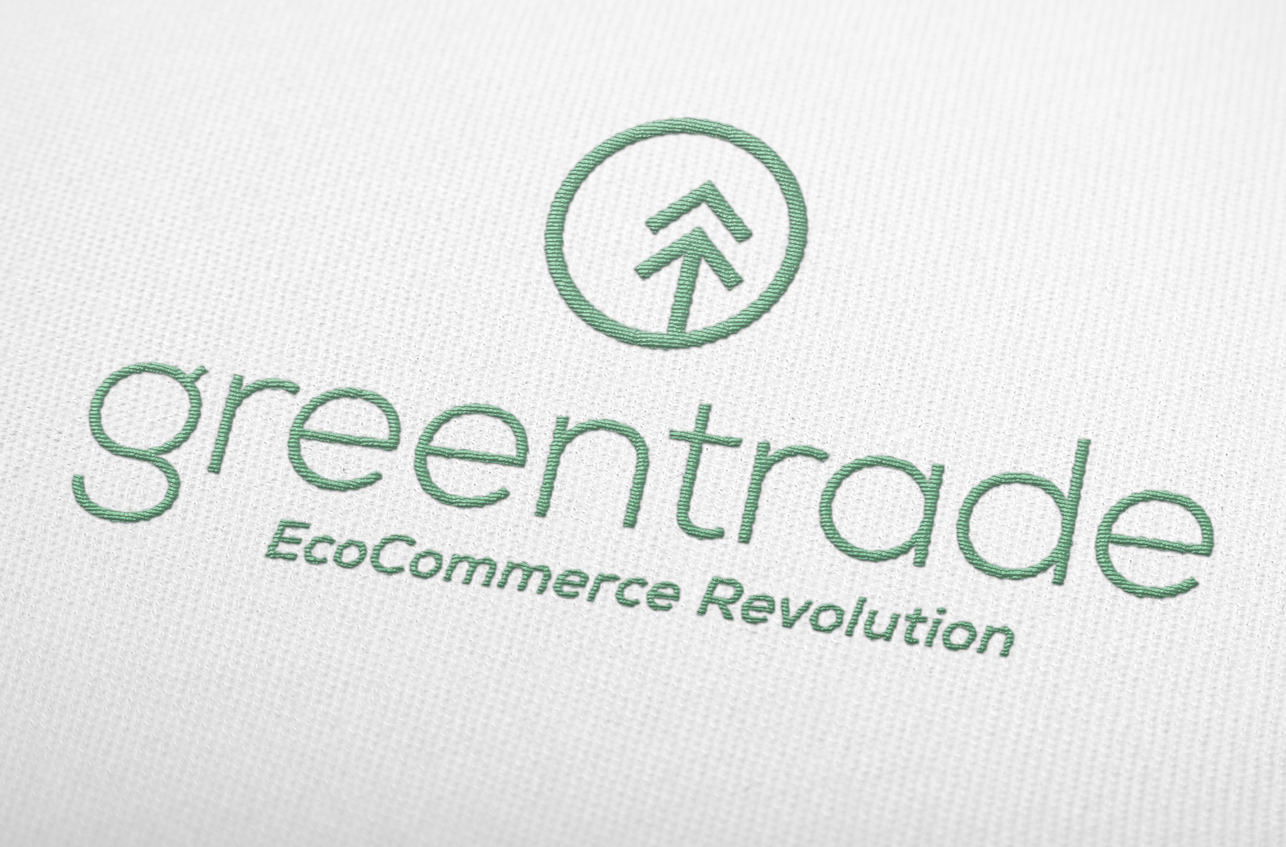


Greentrade's marketing formula appeals equally to consumers motivated by conscience, convenience or compensation. Our brand visuals express the best of these messages with a look that is crisp and current. • ICON • A full circle surrounds two upward-moving arrows, implying to added benefits of a Greentrade transaction to the environment, to the product and to the owner's pocket. In this vein, the arrows are also modeled on a tree. Finally, the placement of the arrows in the circle hint at a "G" and a "T".